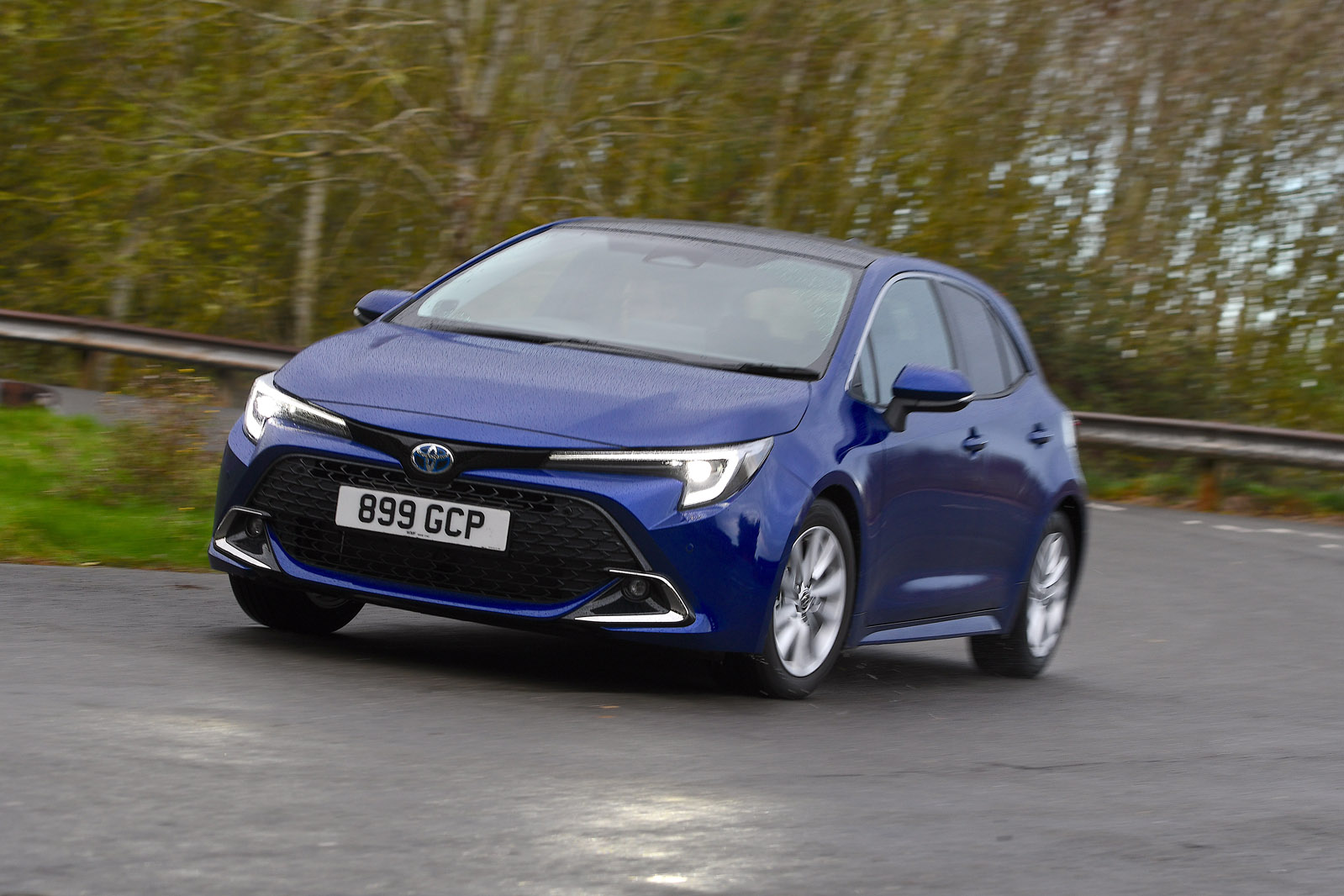
What does the word ‘quality’ mean to you? When talking about the interior of a BMW or Range Rover, it’s often taken to refer to how subjectively ‘nice’ the materials feel. If that is your priority, the Corolla is not the car for you. However, if you take it to refer to the longevity of the components, that’s a different story.
Obviously, we can’t test how a car will hold up over 10 years, but the Corolla feels like you could set off a grenade in its interior and the grenade would come off worse. There is no frivolity to be found among the expanses of black rubberised ‘elephant skin’ and plastic, but it sure feels built to last.
Most of it is extremely easy to use too. There are obvious knobs and buttons for the climate control, chunky switches for functions like the traction control and handbrake, and a pair of military-grade rocker switches for the heated seats. They’re not pretty, but on a cold morning, you’ll be very thankful you can just jab the switch rather than wait for a screen to boot up.
While the Corolla’s interior is pleasantly old-school in its approach to switchgear, it is somewhat unpleasantly old-school in its versatility. The door bins are quite small, and the cupholders are espresso-sized as well. There’s a tray in front of the gearlever. On higher trims, it’s a wireless phone charger, but on lower trims, it’s just hard plastic and stuff tends to slide out of it.
Overall, the Corolla is not the roomiest hatchback you can buy. Compared with a Seat or Cupra Leon, the Corolla 1.8’s boot is slightly smaller (361 litres versus 380) and the 2.0-litre’s boot even smaller still, at 313 litres. It’s in the rear where the Corolla is pretty cramped: by our measurements, the Leon has 10cm more leg room, as well as a decent chunk more head room. The estate is more comfortable in the rear thanks to its longer wheelbase and straighter roof line, but most of its estate rivals will be roomier still.
Infotainment section – 3 Stars
Infotainment has long been Toyota’s Achilles heel. It muddled along with a painfully dated system for a long time, only to replace it with an all-new interface that takes a few steps forwards, but a few steps back as well.
The Corolla launched with Toyota’s old system, which had ugly graphics and a poor navigation system, but did feature some chunky shortcut buttons, and gained wired Apple CarPlay and Android Auto in 2020.
In 2022, all trims except Icon got the newer Toyota Smart Connect+ on an 8.0in screen. The 2023 update kept the same interface, but upgraded the screen to 10.5in for all trims except the van. The new graphics look crisp and modern, the menus aren’t too deep and are pretty logical. There’s no home screen combining media and navigation, however, and it loses its physical controls apart from the volume. There’s a virtual shortcut bar, but it inexplicably disappears when you use smartphone mirroring (which is now wireless), which makes switching between the native interface and phone mirroring quite difficult. As standard, there’s just a solitary USB port, which is joined by another on higher trims.
Some early, low-spec versions had analogue gauges with a smaller screen, but the majority of Corollas have a mostly digital gauge cluster. It has never been the prettiest, most configurable or clearest interface on the market, but for the most part, it has always been largely inoffensive. The 2023 update brought a much more modern and clearer interface that allows for more personalisation. The biggest annoyance remains, however: some vehicle settings, including some of the driver assistance systems, need to be adjusted in a clunky, black and white interface that’s full of impenetrable abbreviations.